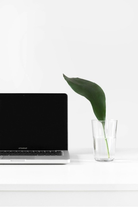
Interior color palettes t6
Color selections designed for modern spaces: balance between neutral tones, warm accents and material surfaces. Practical ideas for living rooms, kitchens and sleeping areas.
When to choose this palette
The t6 palette favors welcoming environments without sacrificing modern character. It is ideal for open spaces with wood elements and matte surfaces, where colored accents are used sparingly.
- Neutral base: warm beige and soft gray
- Accent: terracotta and petroleum for depth
- Materials: linen, matte ceramic, oak wood
Color schemes — variants
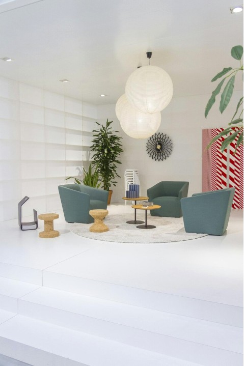
Calm base for walls and textiles; contrast with dark furniture for depth.

Use petroleum and terracotta as accents on furniture or single walls for scenic effect.
Soft palette for bedrooms and studies, combinable with light woods.
Recommended materials
Pairings that work with the t6 palette: natural oak wood, cream-colored matte ceramics, warm brushed metals and natural fabrics like linen and cotton.
- Natural oak — warm tones
- Matte ceramic — neutral surfaces
- Textile coverings — visible texture

Gallery — real applications



Marco Rossi
Personalized color consultation
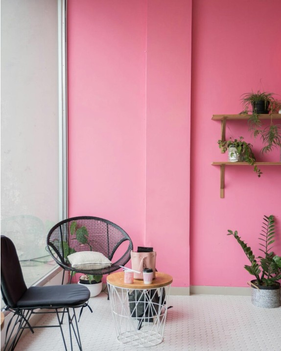
Marco and the Affarizone team offer targeted consultations to adapt the t6 palette to your space, optimizing light, materials and budget.